Main Menu
€ EUR
£ GBP
Order Free Colour Card
Help
Colours
Title 1
Collections
Interior Paints
Exterior Paints
Prestige
By Colour
Blue Paints
Green Paints
Grey Paints
White & Neutral Paints
Yellow Paints
See All Colours
Title 2
Order Free Colour Cards
New Colours
Exteriors
Exterior Collections
Weather Clad
Designer Colour Collections
Exterior Solutions
Exterior Paints
Accessories
Title 2
Application
Brushes
Frames
Paint Trays
Roller Sets
Roller Sleeves
Preparation
Caulk & Fillers
Tapes
Wallpaper Tools
Other Tools
Protection
Dust Sheets
About
Inspiration
Find a stockist
X
Wishlist
Cart
0
Login
Hello
Log In | Sign Up
€ EUR
£ GBP
x
Colours
Collections
Interior Paints
Exterior Paints
Prestige
By Colour
Blue Paints
Green Paints
Grey Paints
White & Neutral Paints
Yellow Paints
See All Colours
Order Free Colour Cards
New Colours
Exteriors
Exterior Collections
Weather Clad
Designer Colour Collections
Exterior Solutions
Exterior Paints
Accessories
Application
Brushes
Frames
Paint Trays
Roller Sets
Roller Sleeves
Preparation
Caulk & Fillers
Tapes
Wallpaper Tools
Other Tools
Protection
Dust Sheets
About
Inspiration
Find a stockist
Wishlist
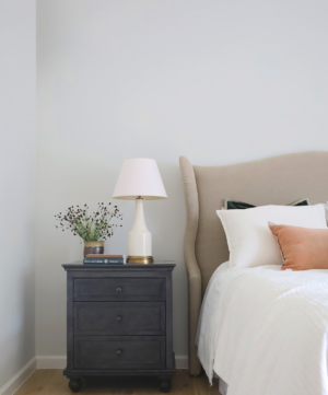
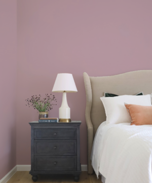
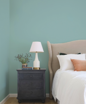
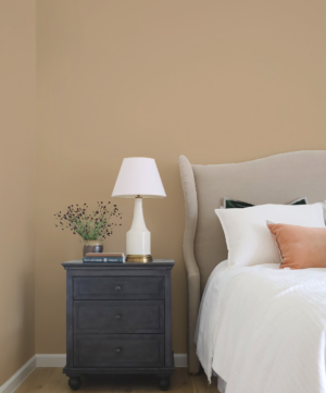
Popular colours
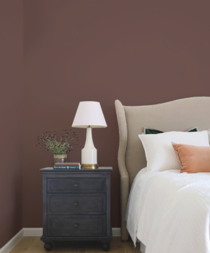
Choose from a carefully selected range of Fleetwood’s most popular colours, from soft pastels to intense tones for interior and exterior surfaces, including wood, plasterboard and brickwork.
Home
>
Paints
>
Collections
>
Popular colours
FILTERS
Colour
-
Whites
Whites
(7)
Neutrals
Neutrals
(28)
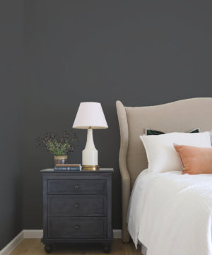
Greys
Greys
(38)
Greens
Greens
(16)
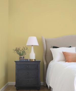
Yellows
Yellows
(9)
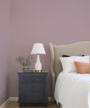
Pinks
Pinks
(10)
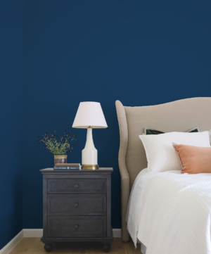
Blues
Blues
(12)
Reds
Reds
(2)
Browns
Browns
(6)
Purples
Purples
(4)
Accessory Type
+
Price
Filter
Price:
—
Filters
Colour
-
Whites
Whites
(7)
Neutrals
Neutrals
(28)
Greys
Greys
(38)
Greens
Greens
(16)
Yellows
Yellows
(9)
Pinks
Pinks
(10)
Blues
Blues
(12)
Reds
Reds
(2)
Browns
Browns
(6)
Purples
Purples
(4)
Accessory Type
+
Price
Filter
Price:
—
Showing 1–44 of 137 Results
Sort by
Sort by Trending
Sort by Latest
Sort by Price: Low to High
Sort by Price: High to Low
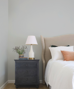
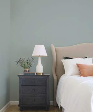
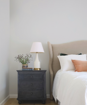
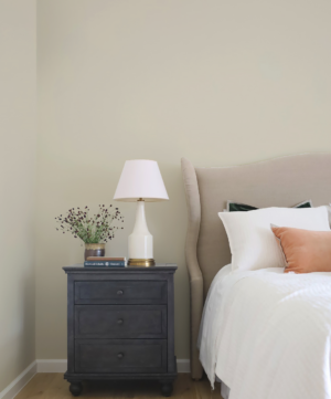
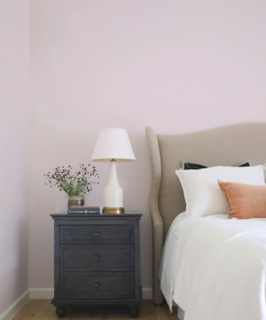
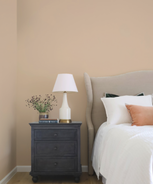
Claystone Grey
From
€
3.95
0
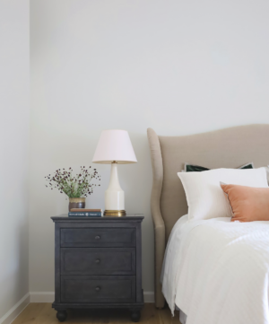
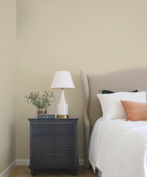
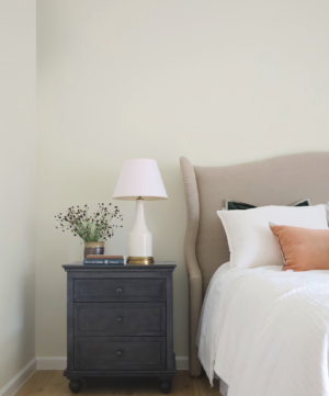
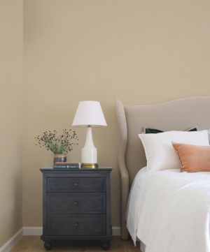
Oxford White
From
€
3.95
13
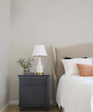
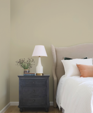
Designer White
From
€
3.95
14
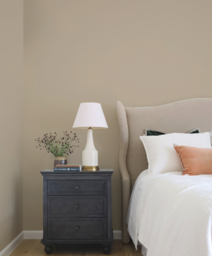
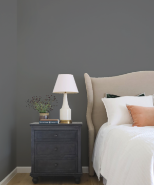
Snowbound
From
€
3.95
14
Eider White
From
€
3.95
12
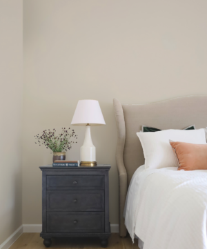
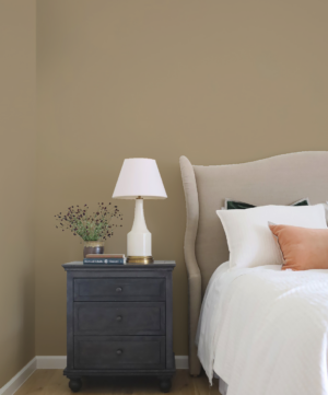
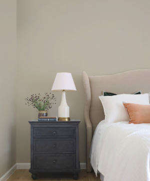
Roasted Almond
From
€
3.95
5
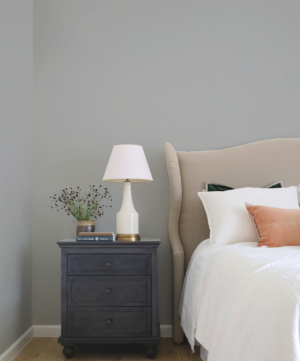
Grey Nuance
From
€
3.95
9
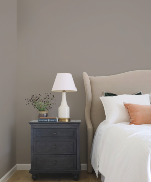
Warm Grey
From
€
3.95
10
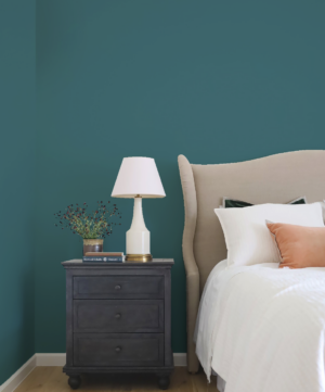
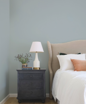
Avalon Teal
From
€
3.95
6
Modern Grey
From
€
3.95
3
Pebble Beach
From
€
3.95
12
Subtle Grey
From
€
3.95
12
White Dove
From
€
3.95
10
Classic Ivory
From
€
3.95
2
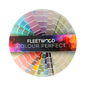
Colour Perfect Fan Deck
€
28.50
1
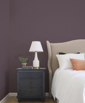
Twilight Purple
From
€
3.95
3
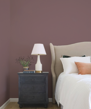
Wild Mulberry
From
€
3.95
1
18th Century Cream
From
€
3.95
13
A Touch Of Taupe
From
€
3.95
13
Aged Leather
From
€
3.95
7
Alpen White
From
€
3.95
4
Almost White
From
€
3.95
8
Amaretti
From
€
3.95
7
Arctic Blonde
From
€
3.95
7
Arctic Spring
From
€
3.95
7
Ash Slate
From
€
3.95
5
Aspen Gold
From
€
3.95
4
Aster
From
€
3.95
5
Azur White
From
€
3.95
9
Ballet Slipper
From
€
3.95
8
Bayberry Blue
From
€
3.95
11
Bayshore Beige
From
€
3.95
17
Bergen Sunset
From
€
3.95
1
Blank Canvas
From
€
3.95
9
Bridal Pink
From
€
3.95
8
Broken Horizon
From
€
3.95
5
Butter Cookie
From
€
3.95
2
Buttermilk
From
€
3.95
1
Candlelight
From
€
3.95
3
Candlelight White
From
€
3.95
2
Caravel Batik
From
€
3.95
5
Cathedral Stone
From
€
3.95
6
Cedar Rose
From
€
3.95
1
Cayman Blue
From
€
3.95
3
Previous page
1
2
3
4
Next page
Follow for infinite inspiration.
Keep up to date with Fleetwood Paints products, news, events and more.
By signing to our newsletter, you agree to our
Terms & Conditions
and
Privacy Policy.
Sign Up
Leave this field empty if you're human: