Main Menu
€ EUR
£ GBP
Order Free Colour Card
Help
Colours
Title 1
Collections
Interior Paints
Exterior Paints
Prestige
By Colour
Blue Paints
Green Paints
Grey Paints
White & Neutral Paints
Yellow Paints
See All Colours
Title 2
Order Free Colour Cards
New Colours
Exteriors
Exterior Collections
Weather Clad
Designer Colour Collections
Exterior Solutions
Exterior Paints
Accessories
Title 2
Application
Brushes
Frames
Paint Trays
Roller Sets
Roller Sleeves
Preparation
Caulk & Fillers
Tapes
Wallpaper Tools
Other Tools
Protection
Dust Sheets
About
Inspiration
Find a stockist
X
Wishlist
Cart
0
Login
Hello
Log In | Sign Up
€ EUR
£ GBP
x
Colours
Collections
Interior Paints
Exterior Paints
Prestige
By Colour
Blue Paints
Green Paints
Grey Paints
White & Neutral Paints
Yellow Paints
See All Colours
Order Free Colour Cards
New Colours
Exteriors
Exterior Collections
Weather Clad
Designer Colour Collections
Exterior Solutions
Exterior Paints
Accessories
Application
Brushes
Frames
Paint Trays
Roller Sets
Roller Sleeves
Preparation
Caulk & Fillers
Tapes
Wallpaper Tools
Other Tools
Protection
Dust Sheets
About
Inspiration
Find a stockist
Wishlist
Kids
Home
>
Paints
>
Collections
>
Kids
FILTERS
Colour
-
Accessory Type
+
Price
Filter
Price:
—
Filters
Colour
-
Accessory Type
+
Price
Filter
Price:
—
Showing the single result
Sort by
Sort by Trending
Sort by Latest
Sort by Price: Low to High
Sort by Price: High to Low
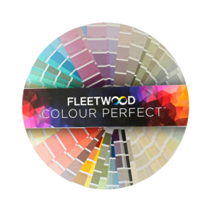
Colour Perfect Fan Deck
€
28.50
1
Follow for infinite inspiration.
Keep up to date with Fleetwood Paints products, news, events and more.
By signing to our newsletter, you agree to our
Terms & Conditions
and
Privacy Policy.
Sign Up
Leave this field empty if you're human: