Fleetwood Logo

Exterior Colour Combination Ideas

Patricia Wakely – Fleetwood Paints Interior Designer

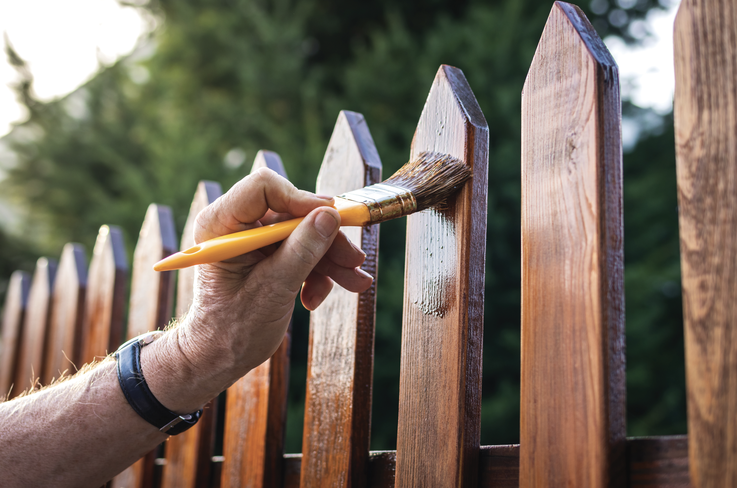
Spring, for me, tends to signify the start of the season for exterior painting, whether it be your house, shed, out-house or garden there is a pill for every ilk in the exterior diagnosis.

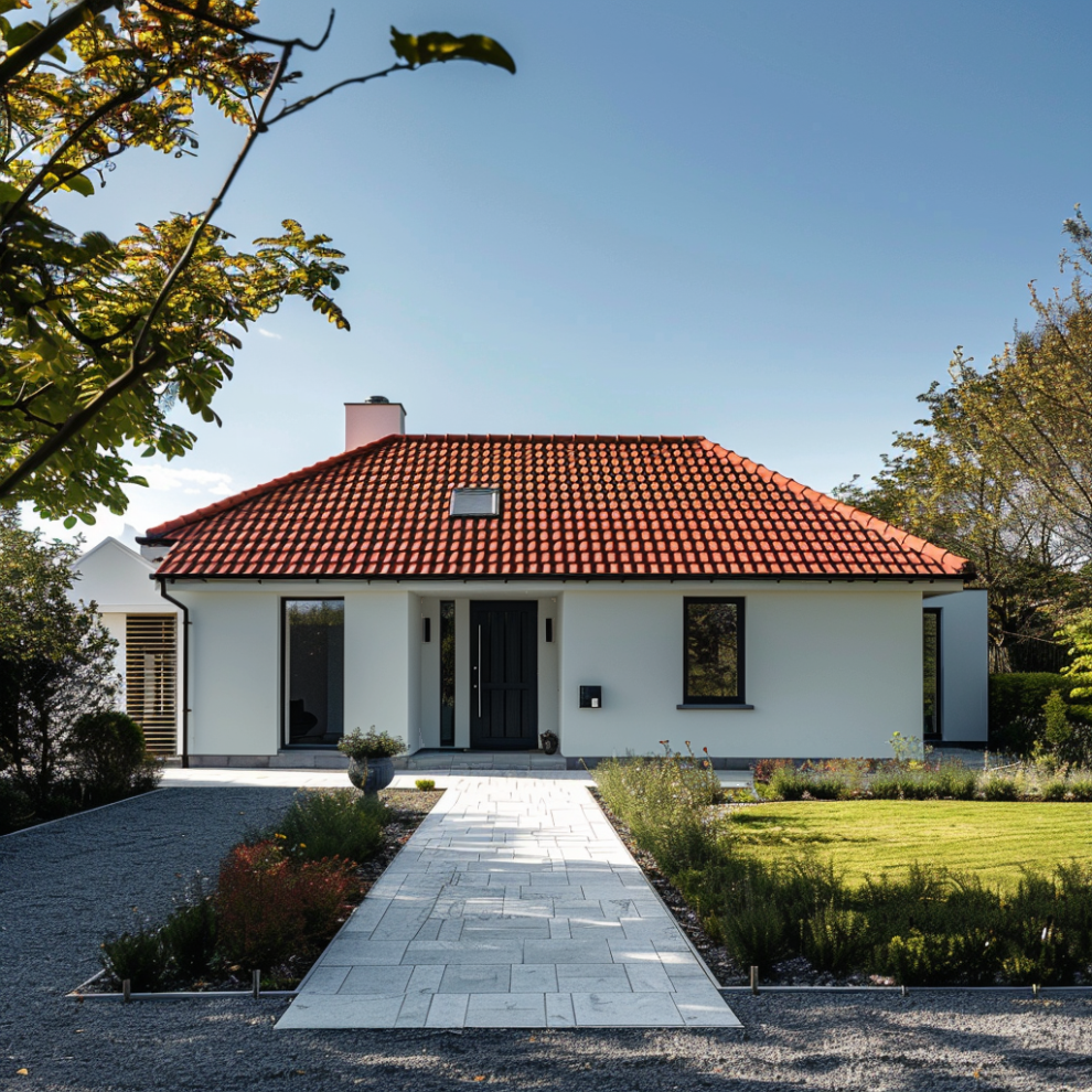
When considering the exterior of your home, apartment or shop it is wise to consider the entire picture as you would your interior, taking all elements into account.  I do like to apply a general rule of picking a particular colour or style for the main portion, harmonising that with a lighter or darker similar colour and lastly creating a pop or feature colour with the front door, windows or garages.  This being a general guide you can choose different combinations relative to the impression you would like to create or the style or purpose of building that it is.


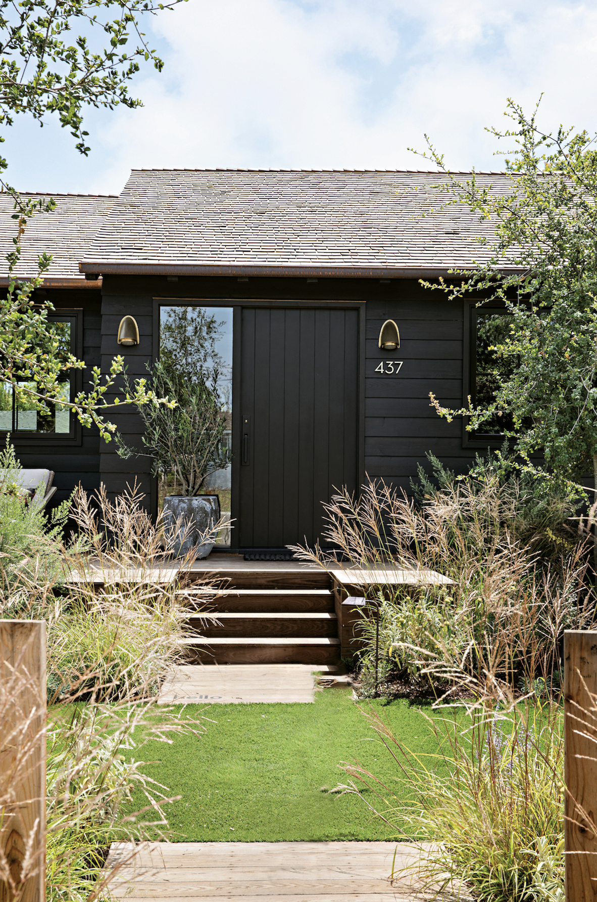
The current trend in exteriors is quite reflective of a change in colour depths used in the interior, in that more rich and moody colours are the choice of the trend-conscious home-owner.  Deep greys, blues and greens are much more popular now than ever before and thankfully we should be all aware that virtually any colour that you can imagine is now available as an exterior masonry paint.


For the more conservative taste that wishes to make a statement only in their doors and trims, dark and rich exterior trim colours are now more sought after and can be found in a rich eggshell, satin or gloss finish.  Colours like Virtuoso, Dawson Street, Simple Grey, and Ballet Blue are now featuring in the exterior brochure from Fleetwood as an indication of what is possible.


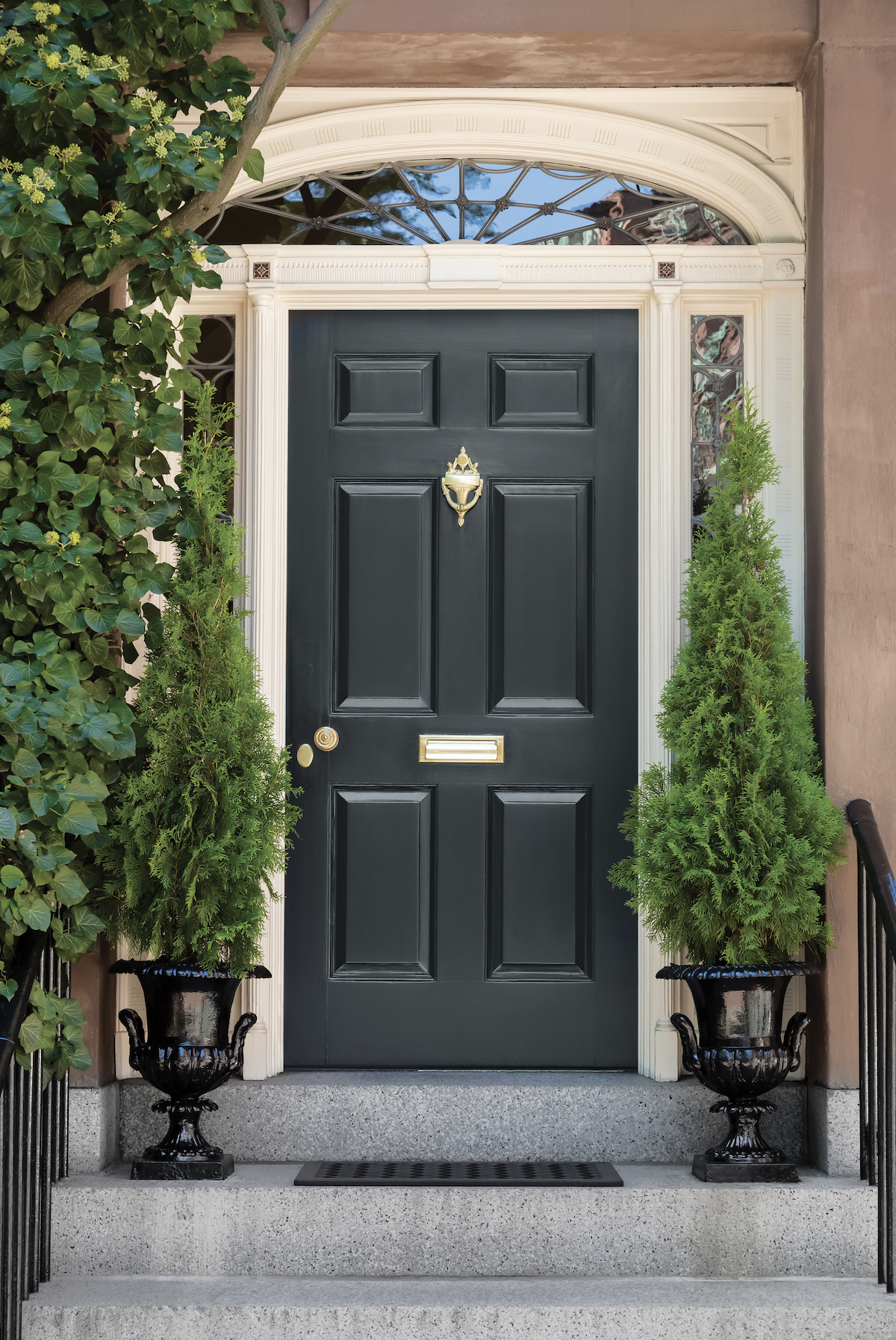
Traditionally the urban home and commercial properties can be seen in vibrant cheery colours, but this is slowly creeping into a nationwide choice.  A home can really reflect the personality of the home-owner within and I say, why not embrace the dark side?  As a guide for a 2 storey townhouse, for example, colours like Kingston Lafferty Taupe for a mid or Sligo Abbey for a deep main colour, and with trims in a soft neutral like Victorian White or Cotton Gin will add a sense of heritage and prestige.  If you decide to choose this richer look then let the main body of the house do the talking and use a dark neutral like Midnight from the understated, elegant Ventura range from Arlene McIntyre to use as a gloss finish on the doors.


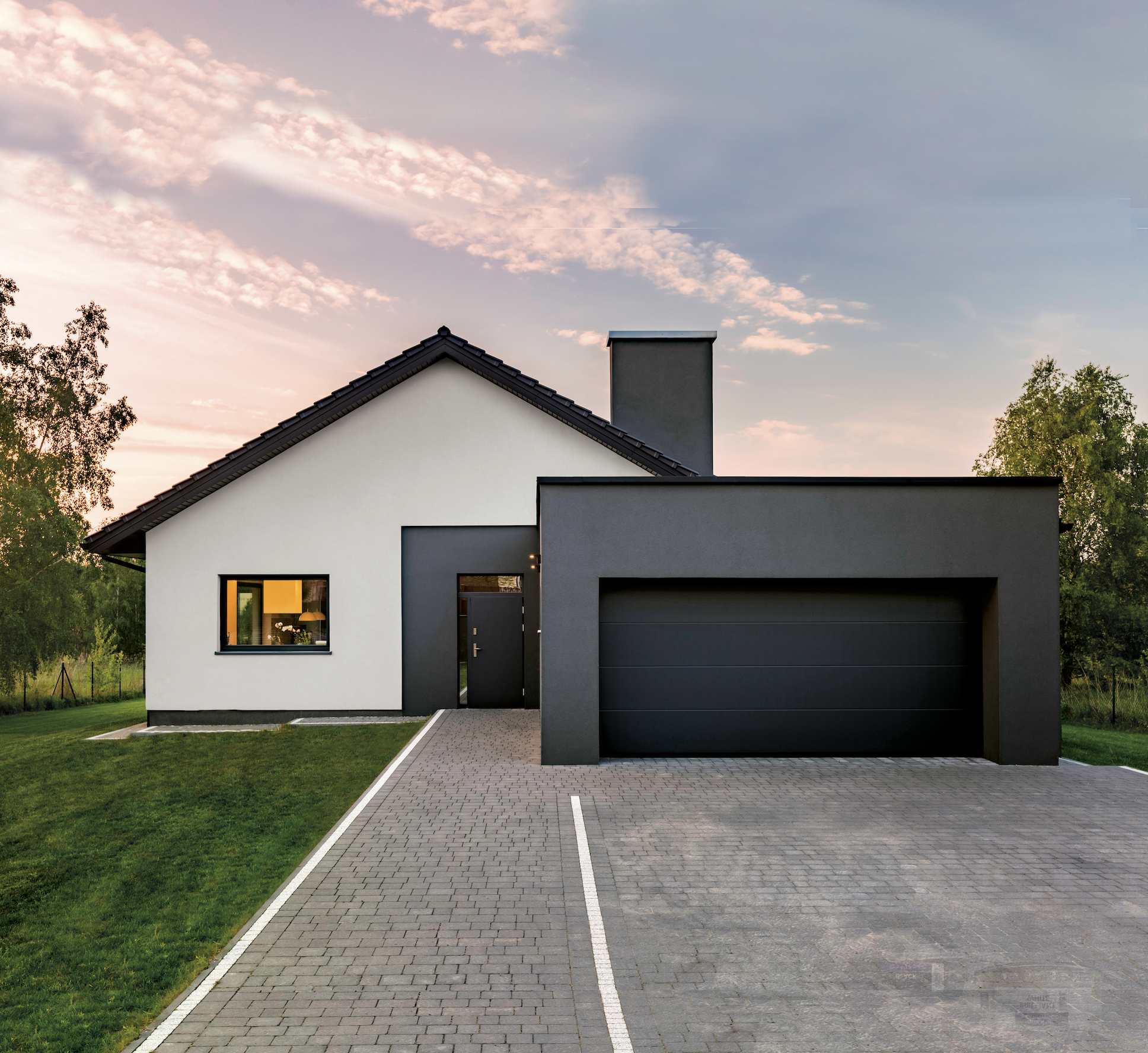
This deeper look can also be embraced in many other styles of building from the single storey to the brick or stone clad semi-detached home.  If considering a home with brickwork I would always recommend balancing the warmth in the brick with a green based neutral like Ashford or in the case of homes with warm stone portions then consider colours like Killiney Hill or Shannon River Fog and door colours like Virtuoso or Paperweight.


Thankfully we can now add colour to more surfaces than might have been possible in the recent past like windows and downpipes etc.  More and more often you may see that owners are updating the look of their homes by using a deep grey on their exterior windows and whilst this does truly transform a building, why stop at deep grey?  A definite add of personality to these details can really make a home look more considered, especially when retaining a neutral modern colour for the body of the building, consider choosing something like New Moon as a window and door colour, with design studio grey as main masonry paint – just remember to prepare correctly with a primer like Bloxx -It tinted to the finished shade for the ultimate deep finish.

Thankfully there is an amazing selection of colours for all surfaces and it is worth stepping slightly outside your comfort zone to reflect your own taste and personality.  Don’t believe me? Just give it a go!

Originally graphic designer turned interior designer Patricia Wakely has been an independent consultant for 20 plus years.  Formerly creator of PLUSH Interiors, working on commercial and predominantly private and domestic projects she provides a wide range of services from imaginative concept design to project management, individual colour consultation to personal shopping and bespoke soft furnishing.  Patricia credits her love and quirky use of colour to her background in graphics and applies it to her work in interiors, with the result her style is truly eclectic, fun and forward thinking.  Patricia sums it up best when she says “Interior design is a reflection of the person within, and good interior design creates a space that fits one’s personality in a beautiful yet functional way.” http://wakelydesign.com/