


Why Chalking Deep is the neutral everyone keeps coming back to
There’s been a noticeable shift in interiors lately. The cool greys and stark minimal spaces that dominated for years are beginning to soften, making way for homes that feel warmer, more layered and far more personal.
At this year’s Ideal Home Show, one colour quietly stood out again and again: Chalking Deep 063 from Prestige by Fleetwood. Rich without being heavy, soft without feeling washed out, it became one of the shades visitors consistently stopped to ask about.
And it’s easy to see why.
Unlike flat beige tones or colder taupes, Chalking Deep sits in that sweet spot between warmth and sophistication. Its subtle pink undertones create depth and softness that change beautifully throughout the day, making spaces feel calmer, m
The new direction for neutrals
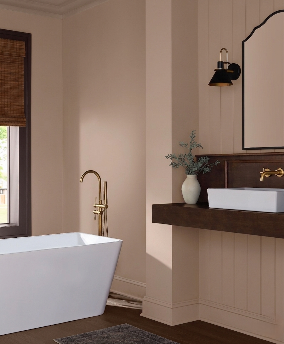
Neutrals are no longer about creating blank spaces. Today’s interiors are moving towards colours with more emotion and character, shades that cocoon rather than disappear into the background.
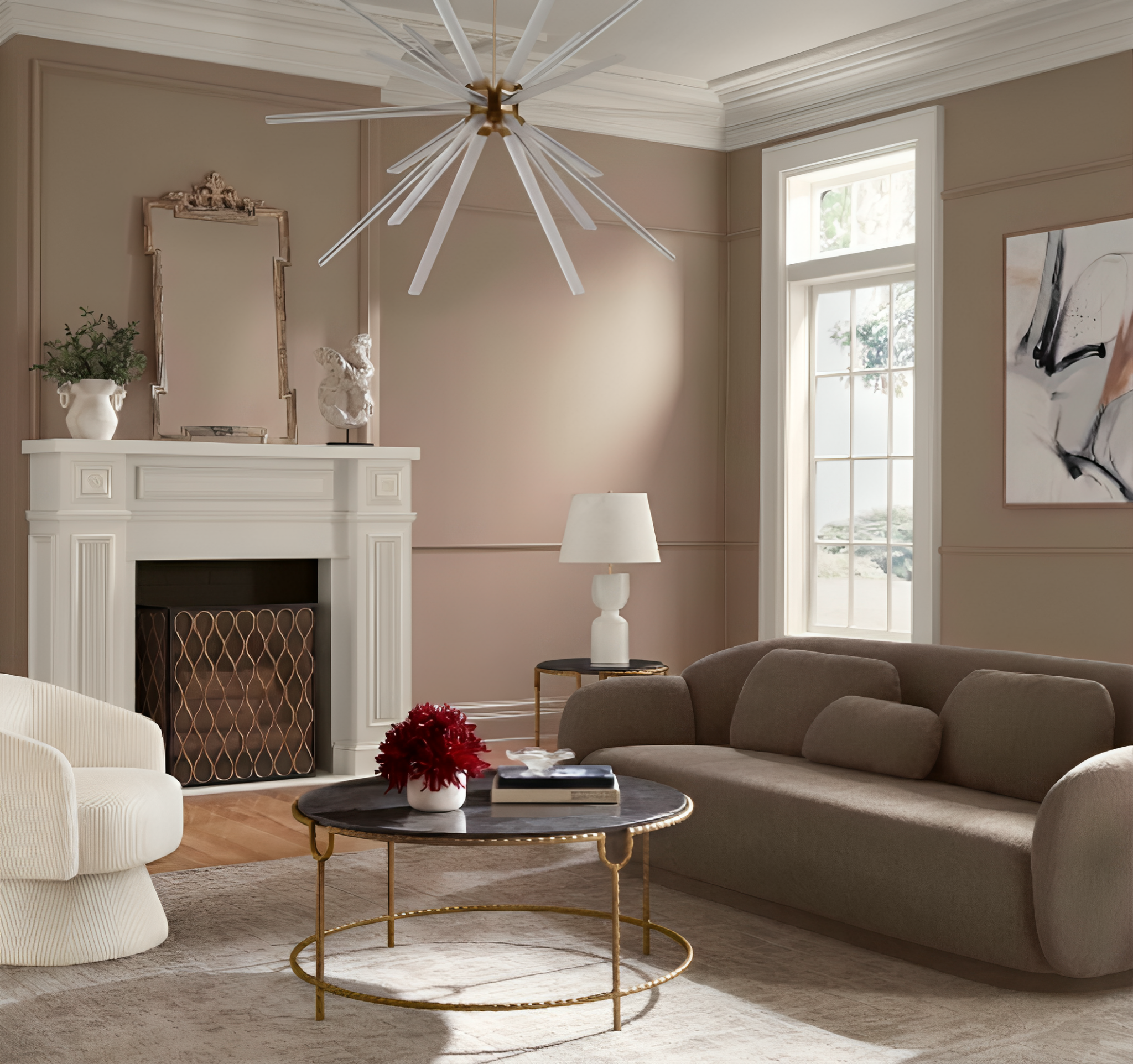
Chalking Deep works because it feels grounded and architectural while still bringing warmth into a room. It pairs effortlessly with natural textures like linen, timber, stone and brushed brass, which is why it suits both contemporary and traditional homes so naturally.
It also works beautifully across open-plan spaces, helping rooms flow together without feeling cold or overly minimal.
A colour that changes with the light
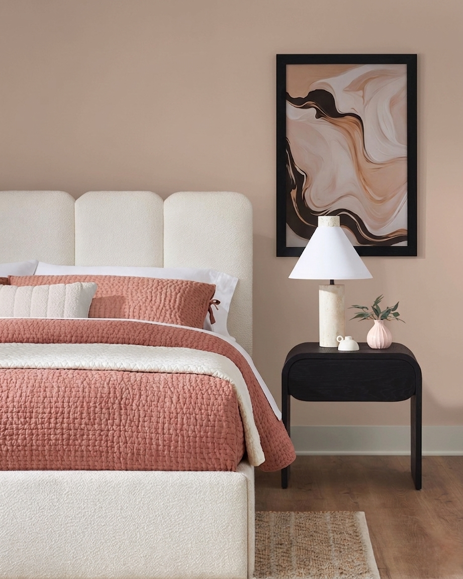
One of the reasons homeowners respond so strongly to Chalking Deep is the way it behaves in different lighting.
In bright natural light, it reads as a soft elevated neutral with a gentle warmth. In the evening, it deepens into something richer and more atmospheric, creating that relaxed cocooning feeling people increasingly want from their homes.
It’s particularly effective in:
- Living rooms
- Bedrooms
- Hallways
- Dining spaces
- Open-plan kitchens
- North-facing rooms that need added warmth
What colours pair beautifully with Chalking Deep?
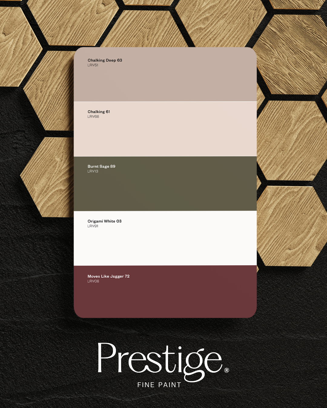
Because of its soft pink undertone, Chalking Deep layers beautifully with earthy and tonal shades.
Some of the most effective pairings include:
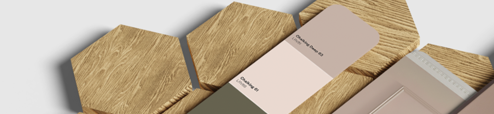
- Warm whites like Chalking 061
- Dusty greens such as Burnt Sage 089
- Deep olives and earthy greens
- Rich walnut and oak timbers
- Soft plaster pinks
- Aged brass and bronze accents
It also works exceptionally well colour drenched across walls, woodwork and ceilings using Prestige Multi-Surface Matt for a seamless, elevated look.
More than just a beautiful colour
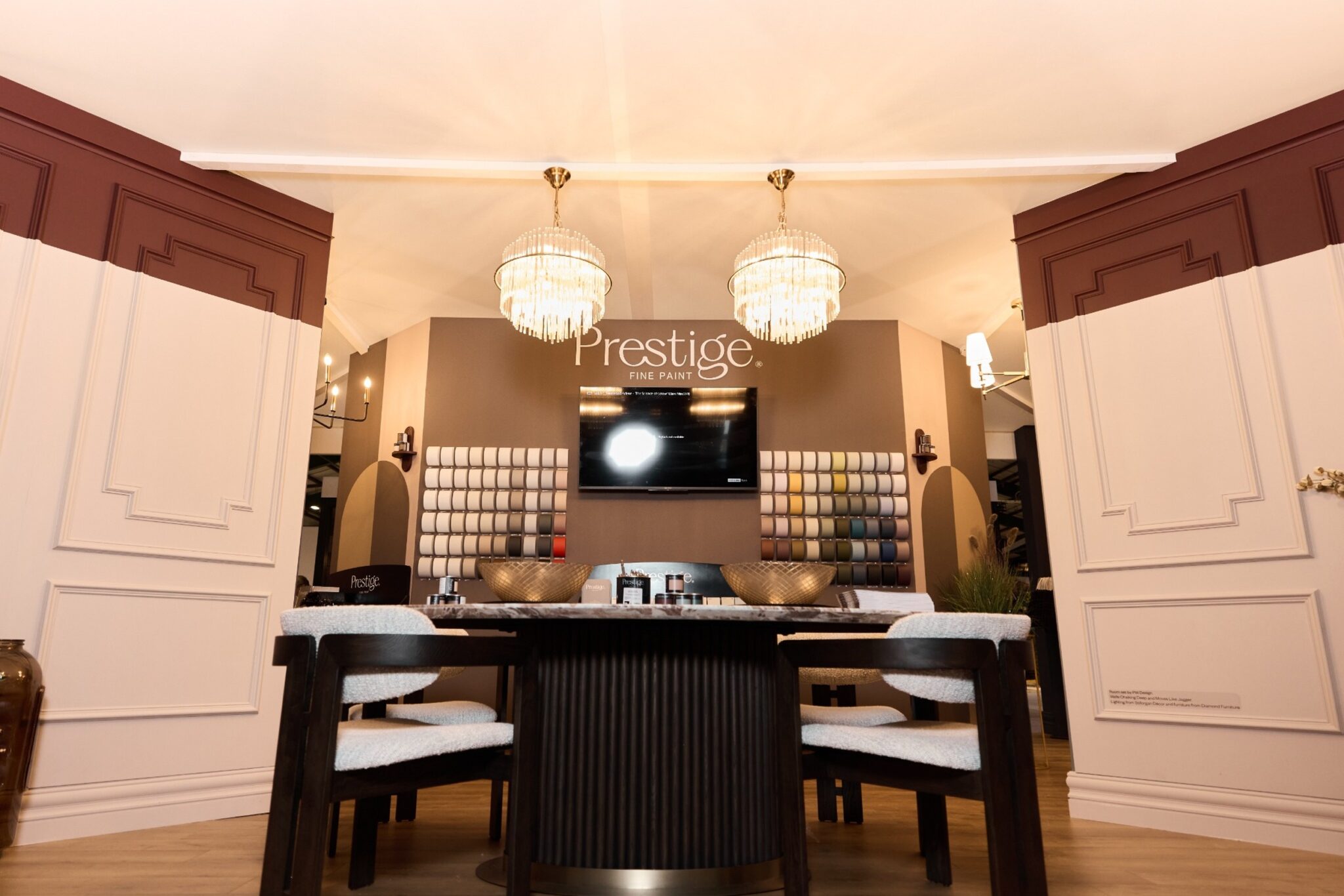
Like every shade in the Prestige collection, Chalking Deep was created with both aesthetics and performance in mind. Prestige paints were developed through extensive collaboration with interior designers who wanted colours that not only looked beautiful, but performed beautifully too.
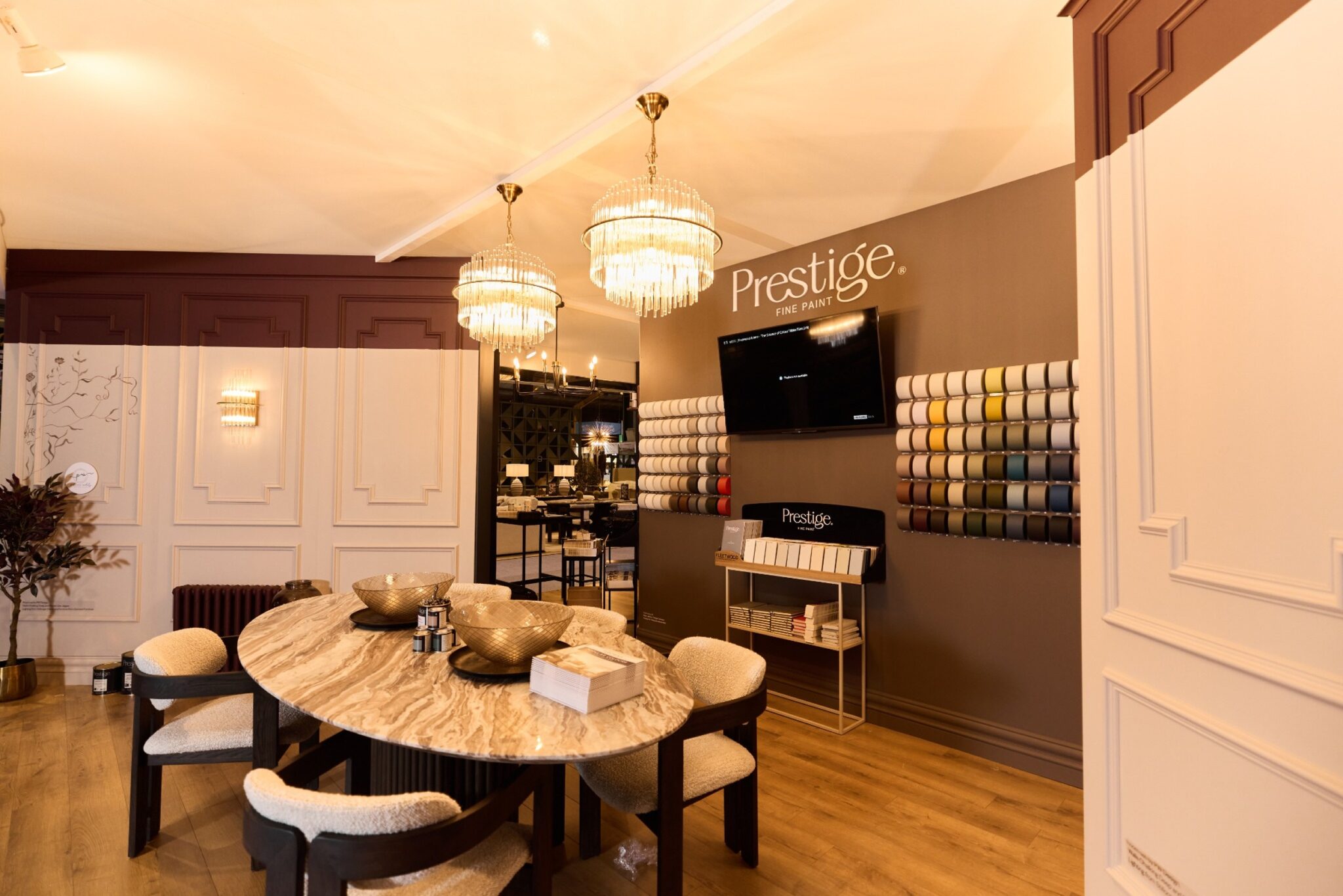
Available in finishes including Prestige Air-Purifying Scrubbable Matt and Prestige Multi-Surface Matt, the range combines rich colour depth with durability designed for real everyday living.
Why homeowners love it
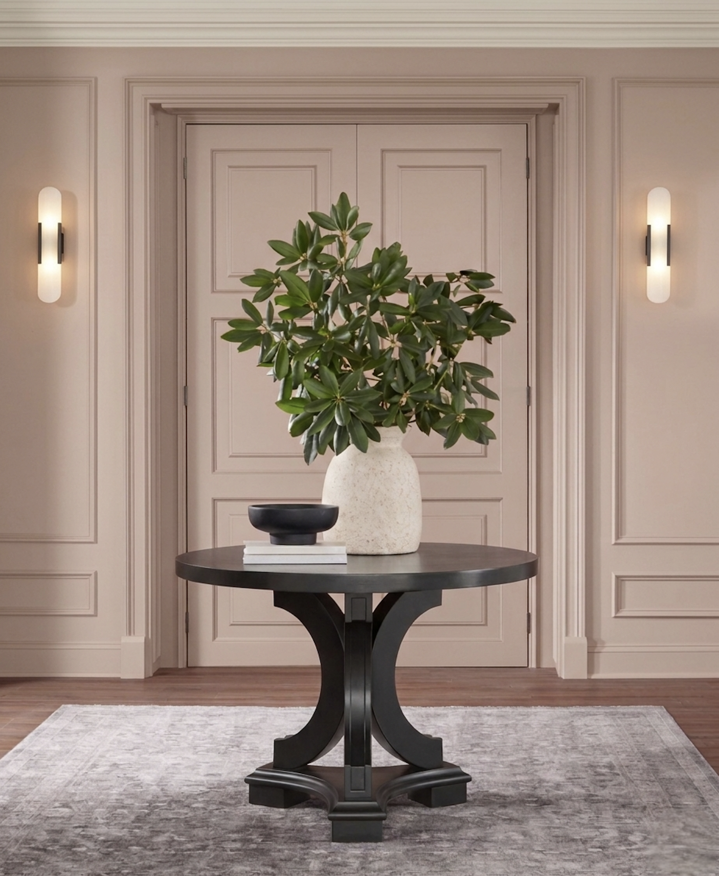
What makes Chalking Deep so versatile is that it doesn’t fight for attention, but it completely transforms how a room feels.
It’s warm but still modern. Sophisticated without being formal. Soft without losing depth.
And in a time where people want homes that feel calmer, quieter and more connected to natural materials, it makes complete sense why this is the neutral everyone keeps returning to!
Explore the Prestige collection at fleetwood.ie/prestige